

Interior design is often perceived as an artistic discipline driven by personal taste and creativity. While creativity plays an essential role, successful color selection is deeply rooted in scientific principles of visual perception, environmental psychology, and color theory. One of the most effective and universally accepted frameworks used by professional interior designers is the 60-30-10 Rule, a proportional system that creates visual balance, hierarchy, and harmony within a space.
Understanding how this rule interacts with color theory allows designers to create interiors that are not only aesthetically pleasing but also psychologically comfortable and functionally effective.
The Science behind Color Perception
Human beings process color through both physiological and psychological mechanisms. Research in environmental psychology demonstrates that colors influence mood, behavior, spatial perception, and even productivity.
For example:
- Neutral tones promote relaxation and reduce visual fatigue.
- Warm colors such as reds, oranges, and yellows stimulate energy and social interaction.
- Cool colors such as blues and greens promote calmness and concentration.
- Contrasting colors increase visual interest and attract attention.
- Harmonious color combinations reduce cognitive load and create feelings of comfort.
Because the human brain naturally seeks visual order, interiors that follow structured color proportions are generally perceived as more balanced and attractive than spaces where colors compete equally for attention.
Understanding the 60-30-10 Rule
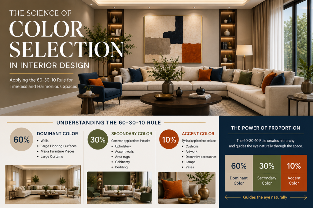
The 60-30-10 Rule is a proportional design principle that divides the color composition of a room into three dominant levels:
60% – Dominant Color
The primary color covering the largest visual area, including:
- Walls
- Large flooring surfaces
- Major furniture pieces
- Large curtains
This color establishes the overall atmosphere of the room.
30% – Secondary Color
The supporting color that complements the dominant color.
Common applications include:
- Upholstery
- Accent walls
- Area rugs
- Cabinetry
- Bedding
This color introduces depth and variation while maintaining visual cohesion.
10% – Accent Color
The smallest yet most impactful color allocation.
Typical applications include:
- Cushions
- Artwork
- Decorative accessories
- Lamps
- Vases
The accent color creates focal points and visual excitement.
The effectiveness of the rule lies in its ability to create hierarchy. Rather than allowing colors to compete equally, it guides the eye naturally through the space.
The Timeless Approach
The Timeless Approach is based on the understanding that neutral colors remain visually appealing across decades and changing design trends. This approach uses a neutral foundation for the dominant 60% portion of the room.
The timeless approach is particularly suitable for residential interiors, luxury hospitality, executive offices, and high-value real estate because it maintains relevance over long periods while allowing easy refreshment through accessories.
Step 1: Assign a Neutral Color to 60%
Common neutral choices include:
- Warm white
- Soft beige
- Greige
- Taupe
- Light gray
- Charcoal gray
These colors provide a stable visual foundation and maximize flexibility for future updates.
Step 2: Apply Color Theory to the Remaining 40%
The remaining 30% and 10% are selected using established color schemes such as:
Monochromatic Scheme
Uses different shades, tones, and tints of a single color.
Example:
- 60% Warm Beige
- 30% Medium Blue
- 10% Navy Blue
Scientific effect:
- Creates visual calmness
- Reduces sensory overload
- Produces sophisticated environments
Complementary Scheme
Uses colors opposite each other on the color wheel.
Example:
- 60% Light Gray
- 30% Blue
- 10% Orange
Scientific effect:
- Creates high visual contrast
- Enhances focal points
- Increases perceived energy
Triadic Scheme
Uses three evenly spaced colors on the color wheel.
Example:
- 60% Warm White
- 30% Blue
- 10% Yellow
Scientific effect:
- Produces dynamic balance
- Creates visual diversity without chaos
- Stimulates engagement
Analogous Scheme
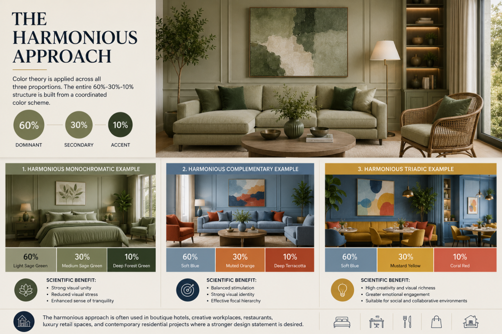
Uses two to three colors positioned next to each other on the color wheel.
Example:
- 60% Warm Beige
- 30% Sage Green
- 10% Deep Green
Scientific effect:
- Creates visual harmony and continuity
- Reduces visual tension
- Produces calm and welcoming environments
Because analogous colors share common undertones, they create a seamless transition between elements within a space while maintaining subtle visual interest. This makes them particularly effective for residential interiors, wellness spaces,
The Harmonious Approach
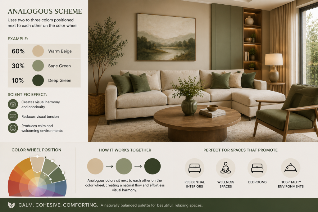
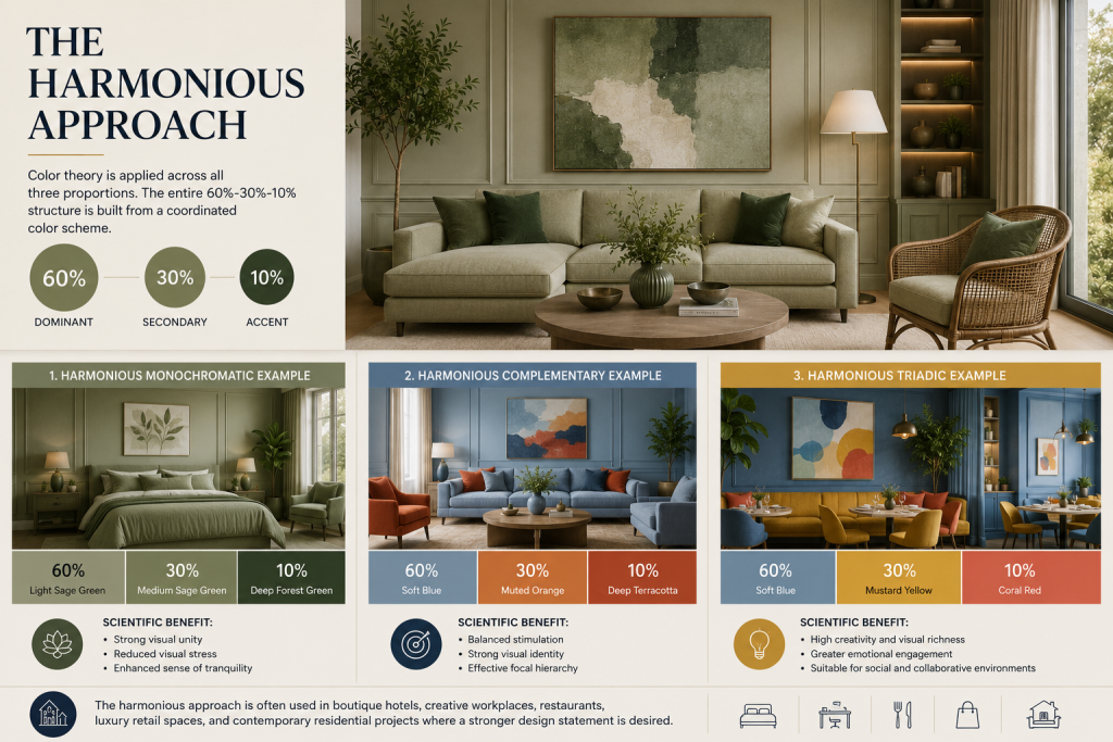
The Harmonious Approach differs fundamentally because color theory is applied across all three proportions rather than reserving the dominant portion for a neutral color. The harmonious approach is often used in boutique hotels, creative workplaces, restaurants, luxury retail spaces, and contemporary residential projects where a stronger design statement is desired.
Here, the entire 60%-30%-10% structure is built from a coordinated color scheme.
Harmonious Monochromatic Example
- 60% Light Sage Green
- 30% Medium Sage Green
- 10% Deep Forest Green
Scientific benefit:
- Strong visual unity
- Reduced visual stress
- Enhanced sense of tranquility
Harmonious Complementary Example
- 60% Soft Blue
- 30% Muted Orange
- 10% Deep Terracotta
Scientific benefit:
- Balanced stimulation
- Strong visual identity
- Effective focal hierarchy
Harmonious Triadic Example
- 60% Soft Blue
- 30% Mustard Yellow
- 10% Coral Red
Scientific benefit:
- High creativity and visual richness
- Greater emotional engagement
- Suitable for social and collaborative environments
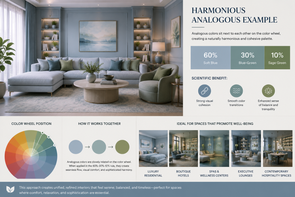
Harmonious Analogous Example
- 60% Soft Blue
- 30% Blue-Green
- 10% Sage Green
Scientific benefit:
- Strong visual cohesion
- Smooth color transitions
- Enhanced sense of balance and tranquility
Analogous color schemes naturally create a harmonious composition because the colors are closely related on the color wheel. When distributed according to the 60%-30%-10% rule, they produce interiors that feel unified, sophisticated, and visually comfortable while still offering enough variation to avoid monotony.
This approach is particularly suitable for luxury residential projects, boutique hotels, spas, wellness centers, executive lounges, and contemporary hospitality spaces where a serene and refined atmosphere is desired.
Why the 60-30-10 Rule Works Scientifically
Several scientific principles explain the effectiveness of the rule.
- Visual Hierarchy
The brain naturally prioritizes larger visual masses before smaller ones.
The 60-30-10 distribution creates a clear sequence:
- Dominant color
- Supporting color
- Accent color
This hierarchy reduces visual confusion.
- Gestalt Principles
Gestalt psychology suggests that people perceive spaces as organized wholes rather than isolated elements.
Balanced color proportions help create:
- Unity
- Continuity
- Coherence
These qualities make spaces feel comfortable and complete.
- Cognitive Load Reduction
When multiple colors occupy equal visual weight, the brain must process more information.
The 60-30-10 structure reduces this burden by providing predictable visual organization.
- Emotional Regulation
Environmental psychology studies demonstrate that color balance affects emotional responses.
Proper color distribution can influence:
- Comfort
- Concentration
- Relaxation
- Creativity
- Social interaction
The proportional relationship is often as important as the colors themselves.
Choosing Between Timeless and Harmonious Design
| Design Goal | Recommended Approach |
| Long-term appeal | Timeless |
| Easy future updates | Timeless |
| Luxury residential design | Timeless |
| Strong visual identity | Harmonious |
| Creative environments | Harmonious |
| Boutique hospitality | Harmonious |
| Contemporary design statements | Harmonious |
The decision should be driven by the intended user experience, project lifespan, and desired emotional atmosphere.
Conclusion
The successful selection of colors in interior design is not merely a matter of personal preference. It is a disciplined process grounded in color theory, environmental psychology, visual perception, and proportional design principles. The 60-30-10 Rule provides a scientifically proven framework for creating balanced interiors by establishing clear visual hierarchy and harmony.
The Timeless Approach achieves enduring elegance by assigning 60% of the space to a neutral color while applying color schemes to the remaining 30% and 10%. The Harmonious Approach, on the other hand, distributes a complete color scheme across all three proportions, creating richer and more expressive environments.
When applied thoughtfully, these methods transform color selection from subjective decoration into a strategic design tool that enhances aesthetics, functionality, and human well-being.